
Getting Curious About the Greens
In the past few weeks, as we’re getting ready to launch the school year, I’ve been building dashboards for my team.
I realized immediately that what seemed like a simple task was more complex. First, the data only makes sense once the team agrees on the strategy itself. Without that alignment, it’s easy to develop dashboards that include every piece of data that we have, to leave out important qualitative data or items that are hard to measure, and to create a dynamic in which team members chase the dashboard metrics rather than the strategy itself.
To avoid that, the most important work isn’t building the dashboard—it’s making sure the team already agrees on the strategy.
But once I had a sense of the right data and views, I found myself asking a more fundamental question: How will people read this data? I kept coming back to a point Peter Drucker made in The Effective Executive: “Good executives focus on opportunities rather than problems. Problems have to be taken care of, of course; they must not be swept under the rug. But problem solving, however necessary, does not produce results. It prevents damage. Exploiting opportunities produces results.”
It’s easy to see how dashboard design could cause a team to do the opposite. Take this example:
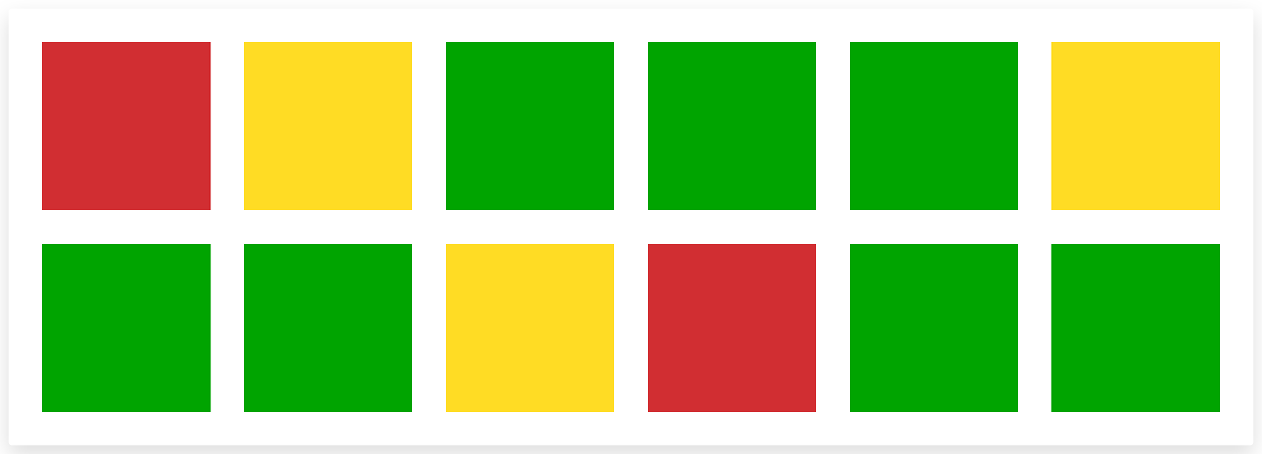
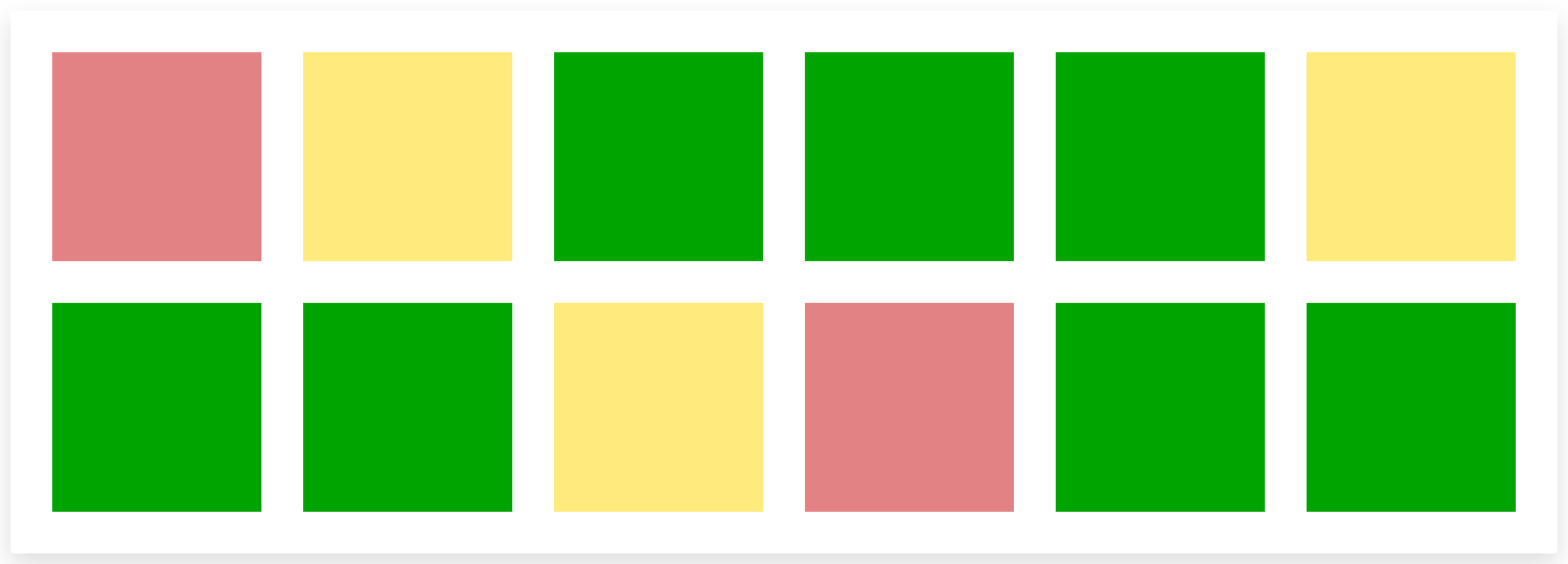
What’s lost in the standard traffic light color scheme is that, by their nature, the Reds and Yellows stand out more than the Greens. Our eyes are drawn to them first, which unwittingly turns us into problem solvers rather than opportunity finders. It feels natural to use the traffic light, but it may be anything but ideal.
As someone who’s read multiple books about color theory, I’m embarrassed that it just occurred to me that it’s possible to take a different approach to the traffic light. One might turn down the intensity of the Reds and Yellows for a more balanced view:
Or even abandon the Reds and Yellows altogether:
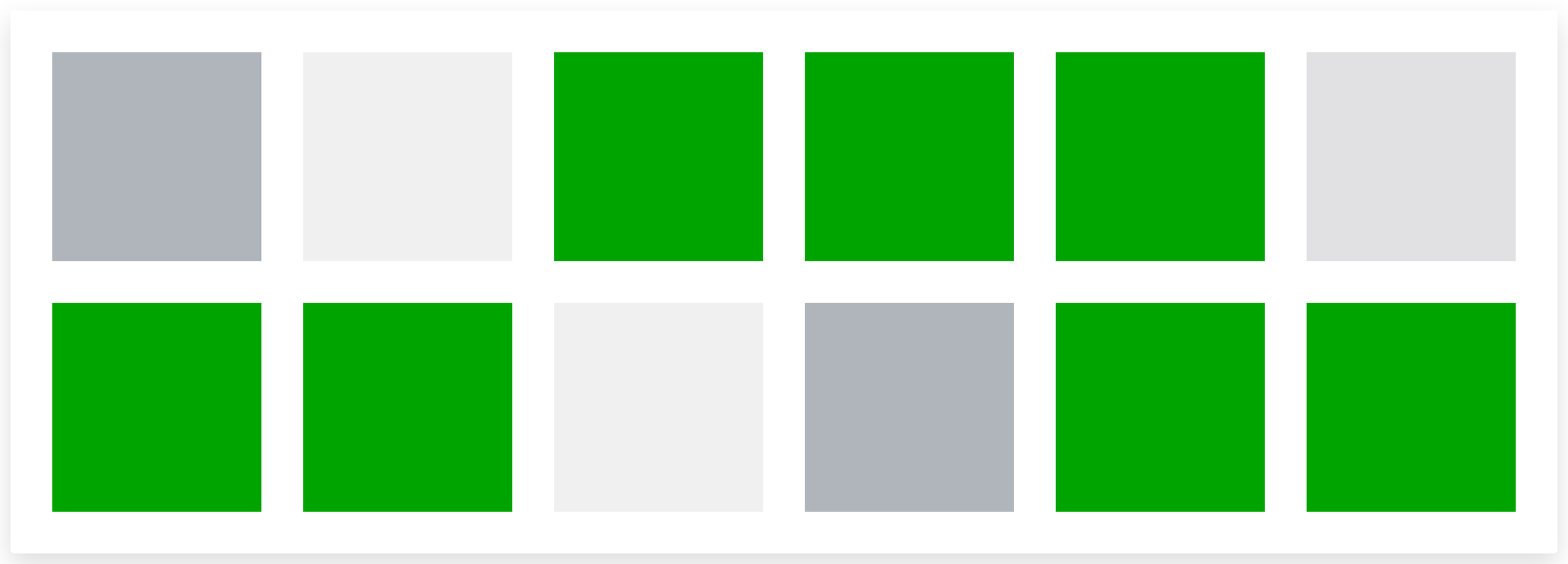
Radical, I know.
The point is that we can design reporting tools around the team conversation we want to have. For example, Drucker advises that a management report should “list opportunities on the first page and leave problems for the second page,” as a practical way to drive a conversation that focuses on opportunities.
But once we get the tools right, it’s worth ensuring our team asks the right questions of the dashboard data.
When we see Yellows, do we conclude that it’s a performance problem or do we investigate whether it’s a result of having set an ambitious goal? For example, if we set a goal to increase a performance metric by 10%, does a 7% increase show as good or bad?
When we see Reds, do we conclude that there’s a problem to solve, or do we ask whether that represents a tradeoff that we’re willing to make? For example, when my sleep tracking app shows a low score, it’s sometimes due to a decision to stay out with good friends—a choice that's almost always worth it.
When we see a dashboard that has all Green, do we conclude that there’s nothing to discuss, or do we get curious? What’s helping us succeed? How can we do more of that? Should we be more ambitious?
We may not be asking the right questions about the Yellows and Reds, and we may not be asking any questions at all about the Greens. The real question, across all three, is whether we're curious enough to ask why.